MEDIA CONTENT
& UX/UI
01
Media Content
EBIKEUNIVERSE

EBIKEUNIVERSE
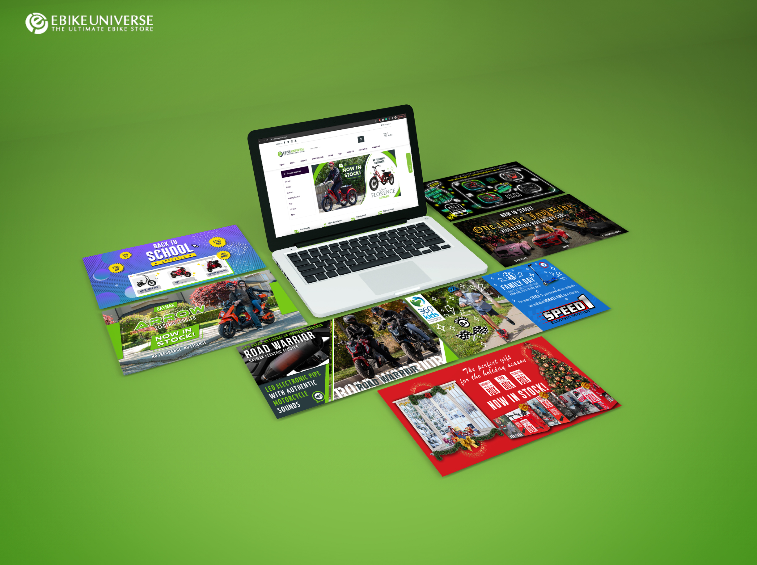
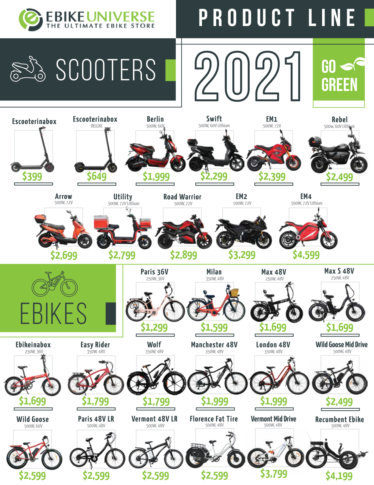
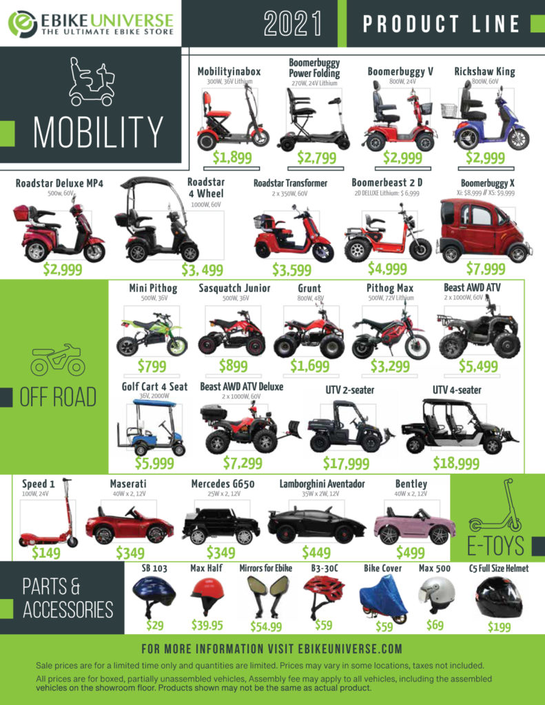
Ebike Universe is the largest all electric retail superstore in North America. Ebike Universe’s goal is to provide the public with eco-friendly alternatives for their daily commutes. Ebike Universe provides sales, service for those new to the industry as well as those experienced in the field.
As the company’s Web and Graphic designer, some of my main responsibilities on the company are:
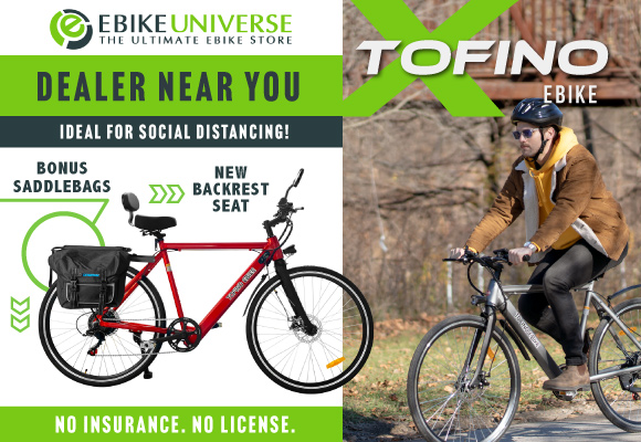
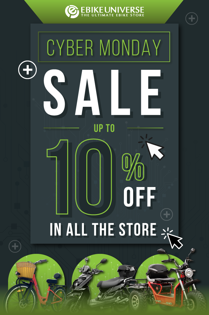
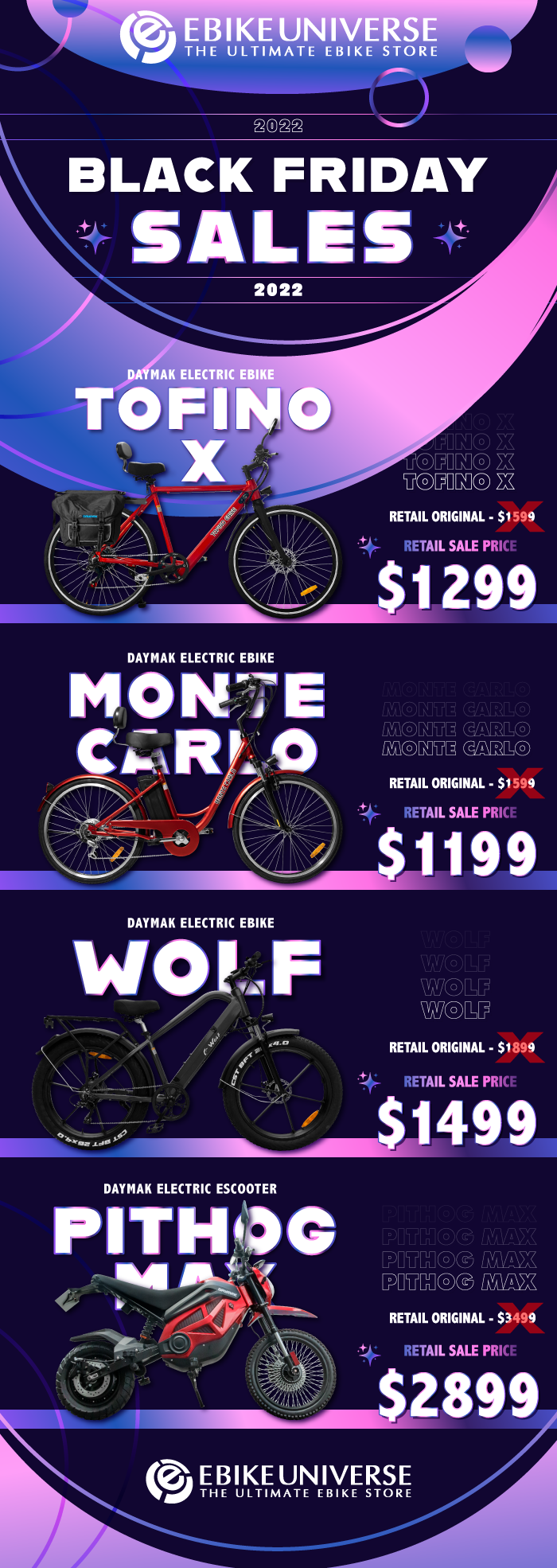
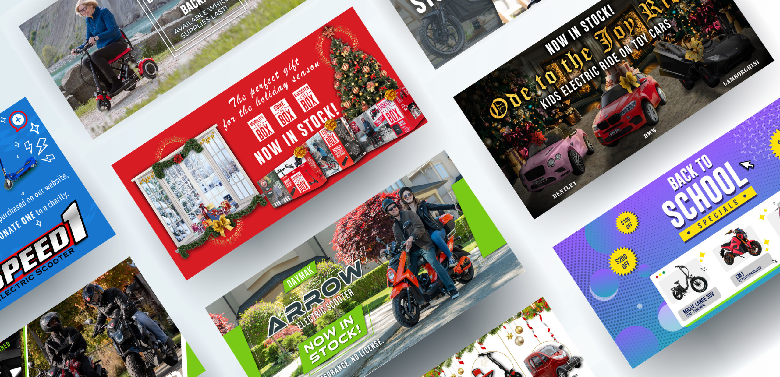
- Work with cross-functional teams to create social media and paid advertising campaigns to achieve user engagement, brand positioning, lead generation and increased sales.
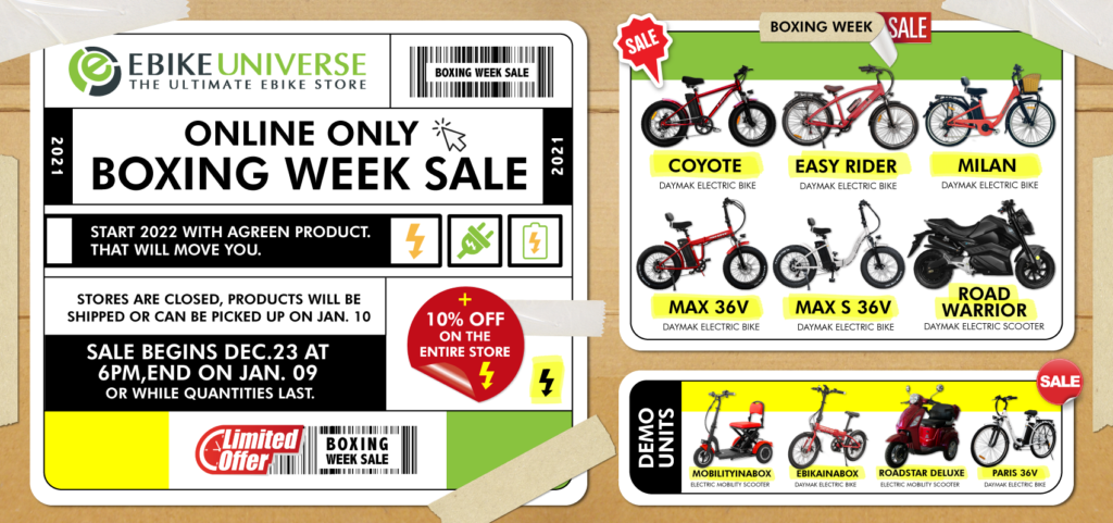
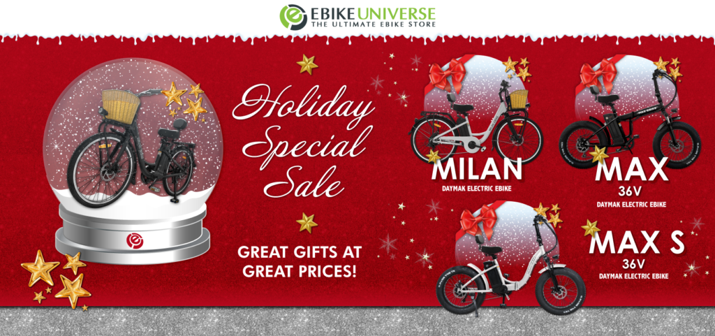
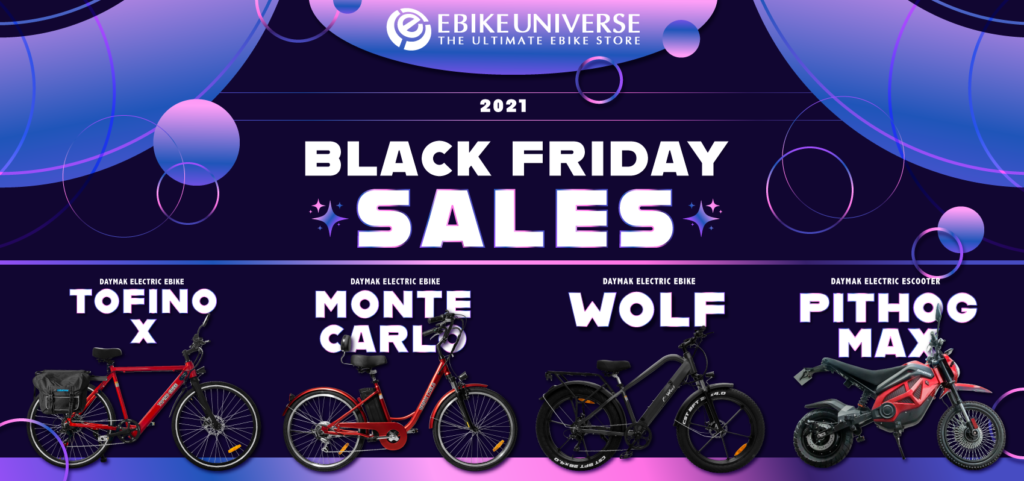
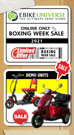
- Design layouts, advertisement banners, and graphic elements for websites.
- Create and develop static and animated Google Ads.
- Design printing material, such as manuals, posters, flyers, among others.
- Develop and creation of images, sketches, layouts, graphics and illustrations that meet the company communications needs.
- Maintenance, management and updates across multiple e-commerce platforms and websites of the company.
- Editing and retouching product photo images, cropping them, and uploading them to various platforms.
- Create and design social media content.
- Coordinate aspects of production for print.
02
UX/UI Design
WEBSITE
Home Page
UX/UI Design - Desktop Version
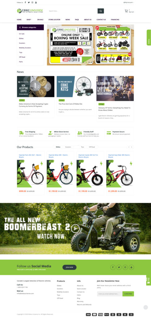
One of my main projects working as a web designer on ebikeuniverse was to improve the whole look of the main e-commerce site of the company.
I established more hierarchies in all the pages, having in mind more smooth navigation and an easy way for the users or customers to find every single section displayed at the front.
The home page is structured in blocks, the first one includes the main menu with a side showcase of all the products sections on the page, beside a carousel slider of banner with news and recent info of ebikeuniverse. The second block consists of the latest post on the company’s blog, newsletters, and PR; these first two sections are on constant rotation, which makes the whole site feels more alive.
The middle block of the page highlight important specification of the company with help of some icons. The fourth section includes a variety of the newest products recently added to the website, and finally, the last block shows a video of the product of the month, a section to give a push to the products that aren’t selling as expected.
Finally, the footer of the page included ebikeuniverse social media, a menu to access different kinds of pages related to the company, and several icons that show how many currencies and payments the e-commerce site accepts in every transaction.
Category Page
UX/UI Design - Desktop Version
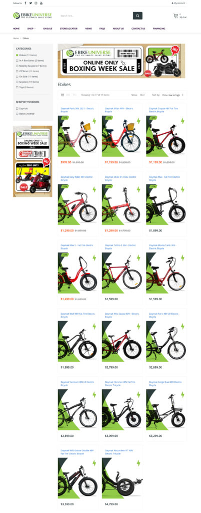
Every category page is arrange with all the products as main focus of the layout, with a couple of banners at the side and top, to advertise extra info to the user, info like sales, new products or any other promotion that the website could have.
Every product have his own thumbnail, and every one of them was designed with a cohesive implementation of elements and colors that ebikeuniverse use, so even though are differents products, they visually look like they belong to the same company.
Product Page
UX/UI Design - Desktop Version
The layout included in all the product pages has a similar structure that the whole website, having the product as the main climax, the price, and some pictures of the product are all way on the top of the page, besides some info regarding currencies and payments that the e-commerce site accepts.
The next section shows the specifications, videos, and manual of the product, plus a detailed description, an explanation that includes lifestyle images and close-ups, displayed on hierarchies that shows an easy way to digest information.

