UX / UI
DAYMAK
01
UX/UI Design
DAYMAK CASE STUDY
DAYMAK
With headquarters in Toronto, Daymak is a pioneer in personal light electric vehicles (LEVs). Daymak is the number one distributor and developer of LEVs in Canada with more than 100,000 vehicles sold, and is known for cutting-edge designs like the world’s first fully wireless e-bike and Canada’s first solar-powered, off-road e-bike.
As the company’s Web and Graphic designer, I was in charge of the concept design for Dymak’s new website; after more than 6 years with same, the company finally decide to move forward and update the website, It became an incredibly time-consuming project because the previous site was built in a platform that is no longer support or convenient to handle, Adobe Muse, so, It was decided that the new website should be on a platform like WordPress, a platform more friendly and easy to use and update, and with that situation, I did some proposals for the new website look. The main Daymak website is not an online store, is more like a brand technology website, and the main function of the site is being a catalog of the products that the company has and the new products that will arrive.
With that information as a reference, these were some of the proposals made. One of the limitations established before starting working on the new website was keeping the same information, banners, and buttons displayed on the old site.
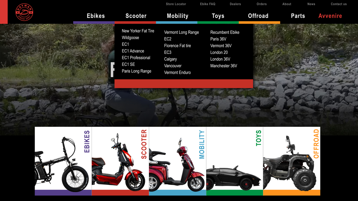
Daymak has a variety of electric vehicles in different categories, so for this idea, I established a unique color for each category, giving more distinction between them.
The top of the page was designed to have a Daymak’s promotional video playing in the background all the time, followed by sectioned pictures of diverse electric vehicles that refers to each category where they belong. Eventually is showing the latest news on the blogs post of the site, banners with new products or monthly’s highlights, and finally, the standard footer of the website, with sections where the user can find specific needs in every page, plus, a way to subscribe to the company’s newsletter.
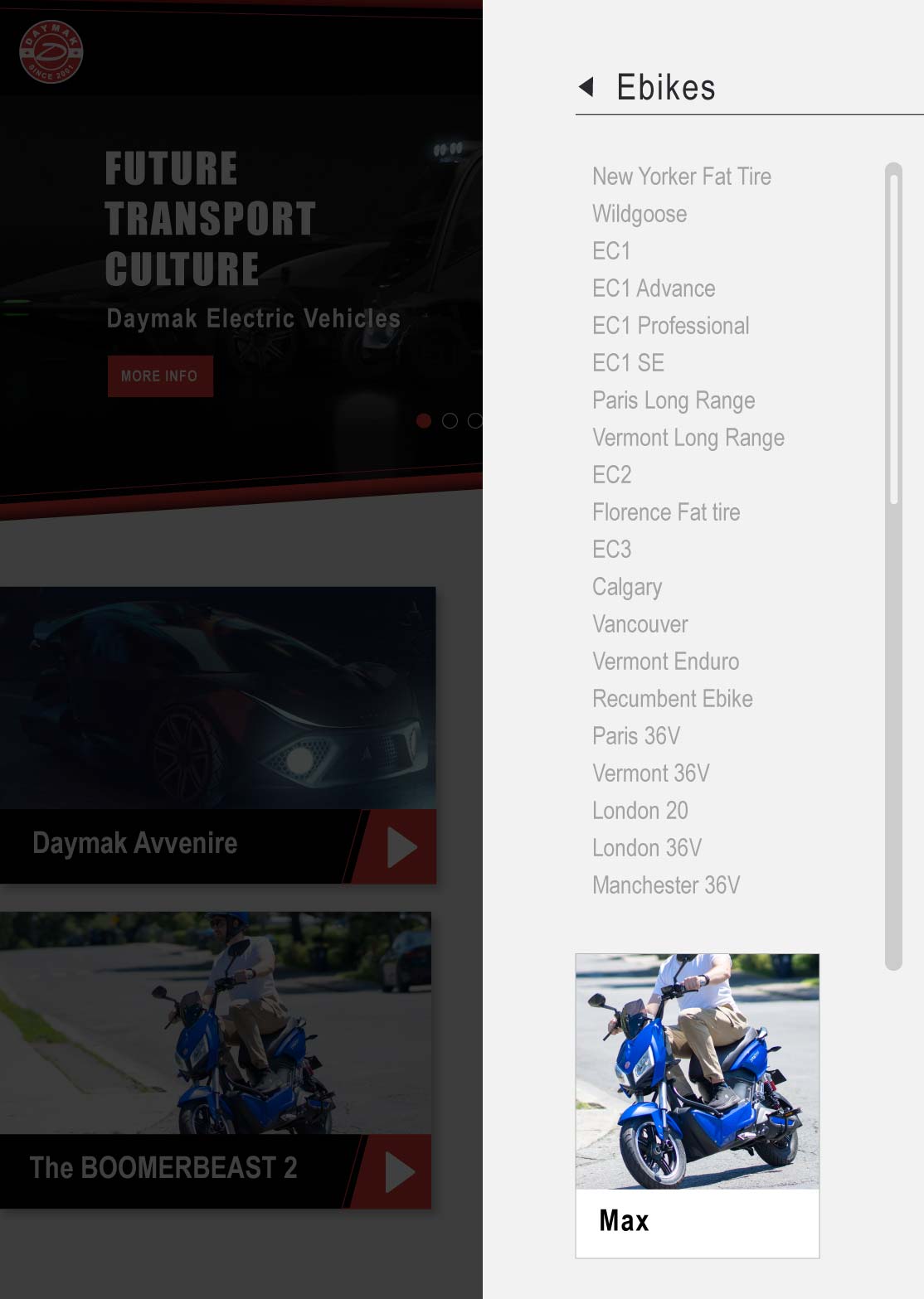
The top menu of the page is keeping the same idea of the whole design, every category have his own color. The mega menu display the name of every product on each category.
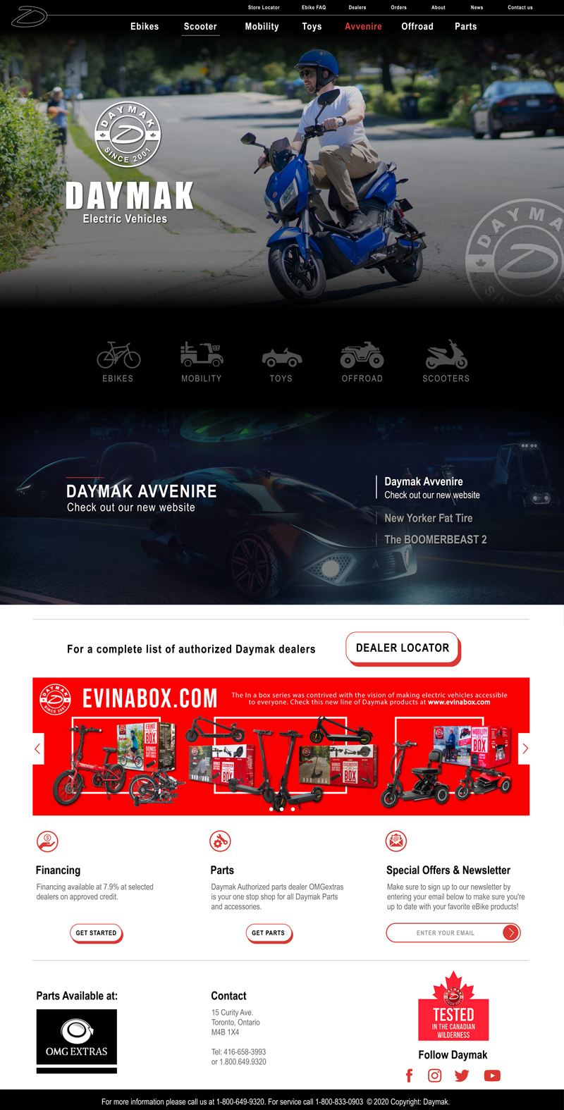
The main purpose of this design version was to make a minimalistic approach to the Daymak’s website.
For this concept, on top of the page, I decided that an image of the latest product being used will serve as a good way to maintain the website fresh and updated constantly. After that, I designed some icons/pictograms to represent each category inside Daymak’s catalog, using more pictograms and icons throughout the whole design of the website showed my intentions of make a more clean and futuristic page overall. I kept the same aesthetic and design for the images slider and banners, including all the remaining aspects of the previous website in the footer.
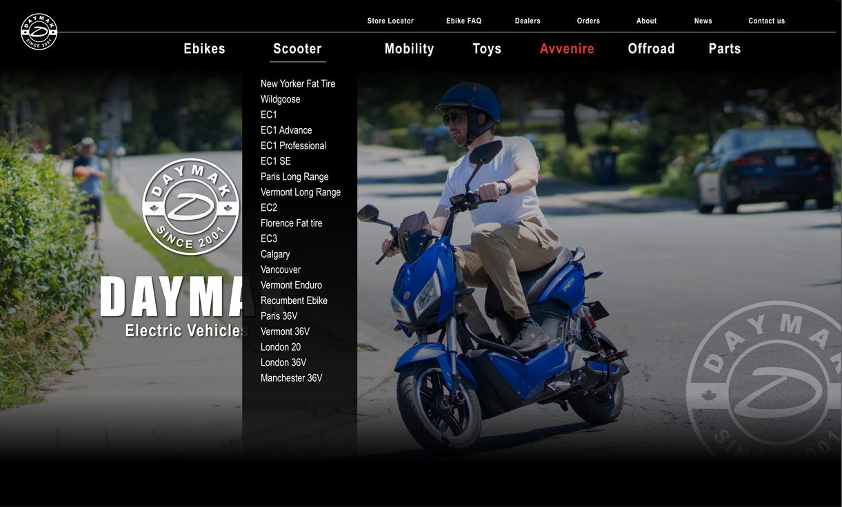
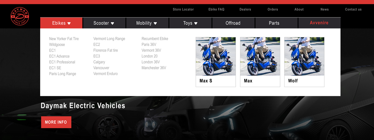
For the top menu of the page, I needed to keep all the options and information on it, so I decided to go with a mega menu, which Is a modern and convenient way to include a lot of information or products in a stylish way, it also keeps the minimalist feeling of the whole design.
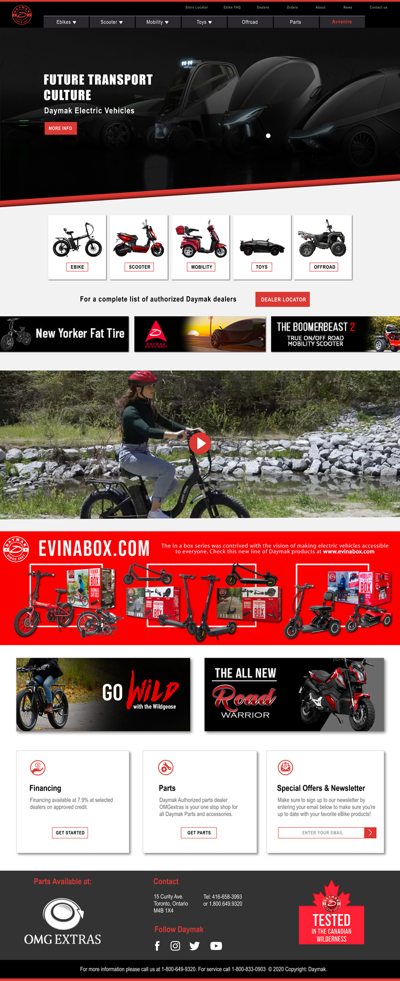
The main idea of this design was to combine both concepts of the previous proposals.
Sharp and straight lines were part of the structure for this design, for this option, the top of the page has a pictures slide that will include the new products or monthly’s highlights of the company, followed by reduced-size pictures of different electric vehicles from each category that Daymak has. Next on the page, some small advertising banners are showing, and below that, a full promotional video was placed, this video will remain on pause until the user decides to play it. Before the footer, I included some banners to showcase some extra content that Daymak usually shows on certain seasons.
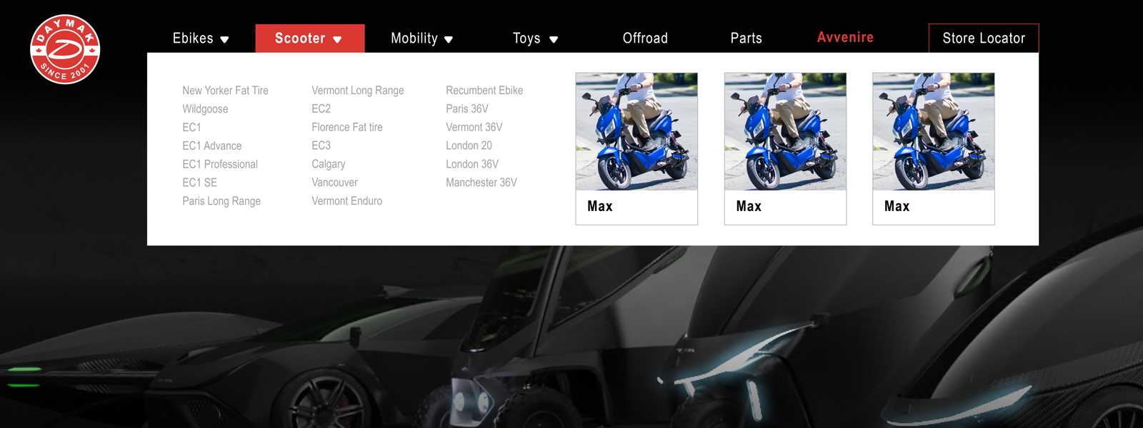
A mega menu was the selected choice for this version of the website as well. This menu showcases a more extended section for each option, besides all the names of the products of each category, it also displays the three latest products added to the list with a small picture as highlights of the segment.
FINAL DESIGN
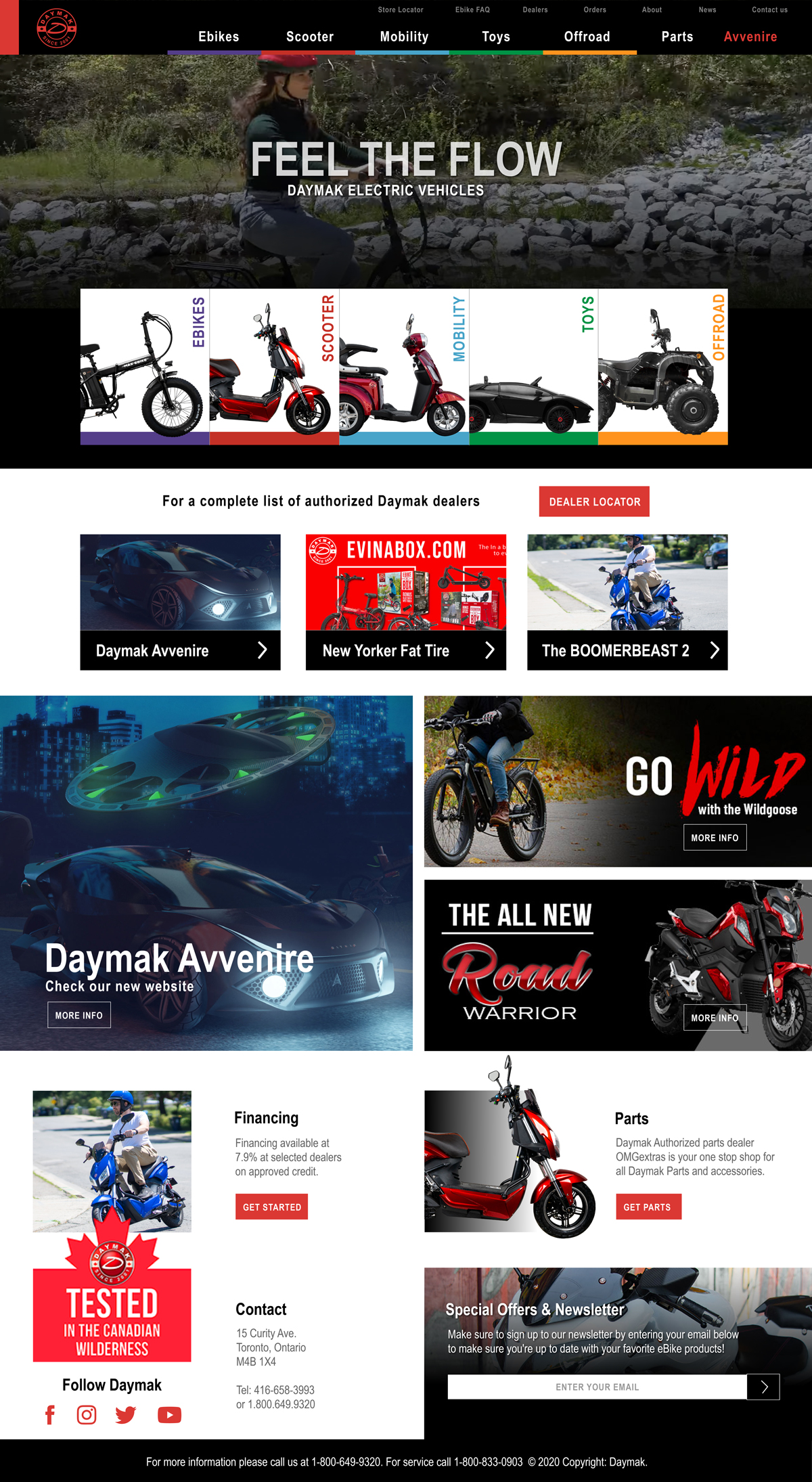
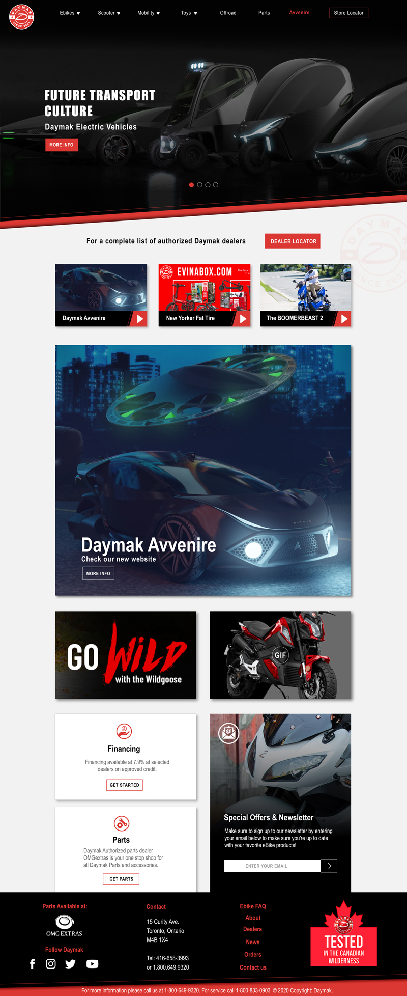
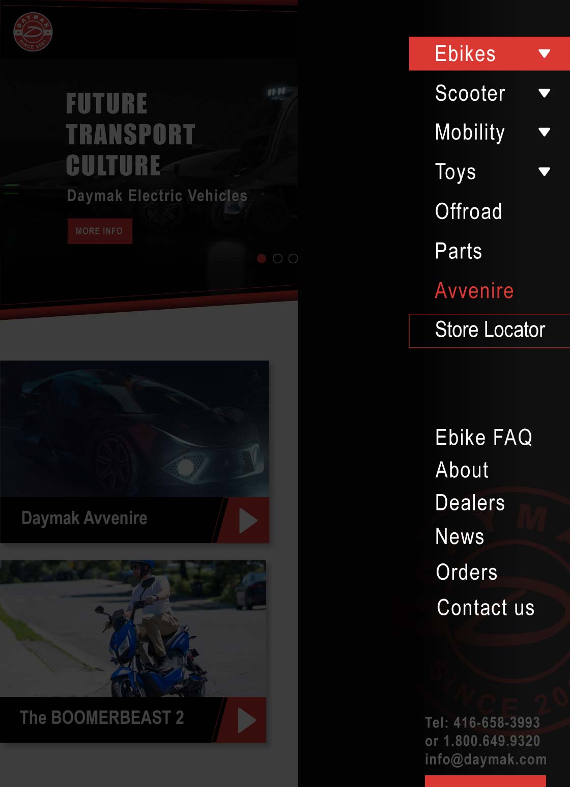
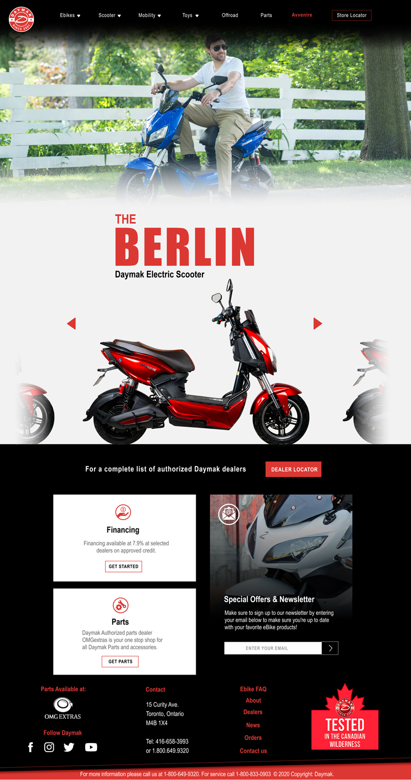
For the final design, I decided to merge specific aspects of the three previous proposals, I established a clean and minimalistic aesthetic on some sections of the website design, the inclusion of the mega menu on the header was definitely an important piece of the website redesign, as required, the same company’s color pallet, banners, and highlights where keep as well.
Some icons were designed to part of the footer of the page, these pictograms were placed beside the services that Daymak offers to their dealers.
