UX / UI
IN A BOX SERIES
01
UX/UI Design
INABOX CASE STUDY
IN A BOX SERIES
The In a box series was contrived with the vision of making electric vehicles accessible to everyone. With the goal of simple assembly, easy accessibility and something for everyone in mind, we watched this quickly flourish and take shape. These affordable electric vehicles can be assembled in mere minutes, and are backed with our 1-year full guarantee.
All EV in a box products come’s with an additional bonus gift, and free shipping across the continental United States and Europe. The “in a box series” includes the ebike in a box, the scooter in a box/ scooter in a box DELUXE, and the mobility in a box.
As the company’s Web and Graphic designer, I was in charge of the concept design for Dymak’s new Ecommerce Store website; The “in a box series” needed a proper site to display and sell the different products of the collection, as requirements, I was told that the color pallet of the brand should be remaining the same, the color red should be the primary color on the overall design, besides that, I was free to implement any possible idea to the website on the time frame that I was given.
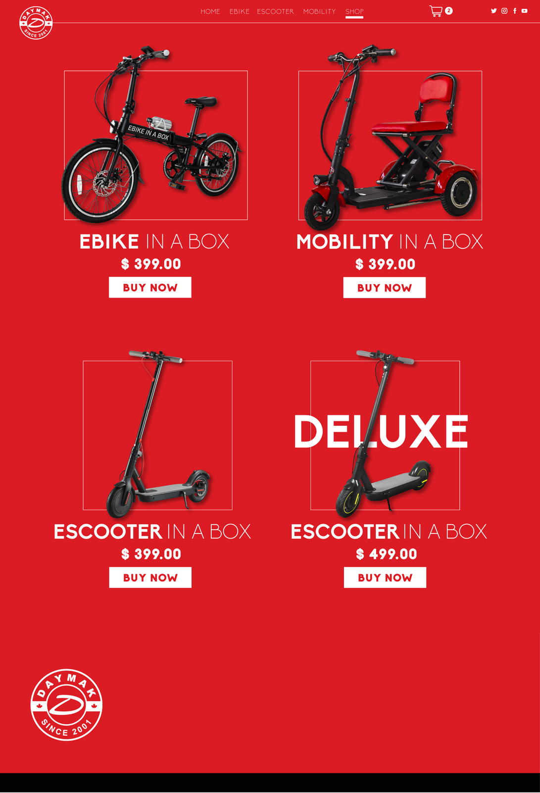
The series included a total of four products, the electric bike, the mobility scooter, the electric scooter, and the electric scooter deluxe.
The main purpose of the website, besides being an e-commerce store, is to showcase the quality, portability, and practicality of the electric vehicles that come fold inside of a box.
Going through the design of the website, the idea of displaying every aspect of each product was a priority, I arrange some blocks of typography with a variety of hierarchies with the intention of accentuating relevant information and characteristics of the goods.
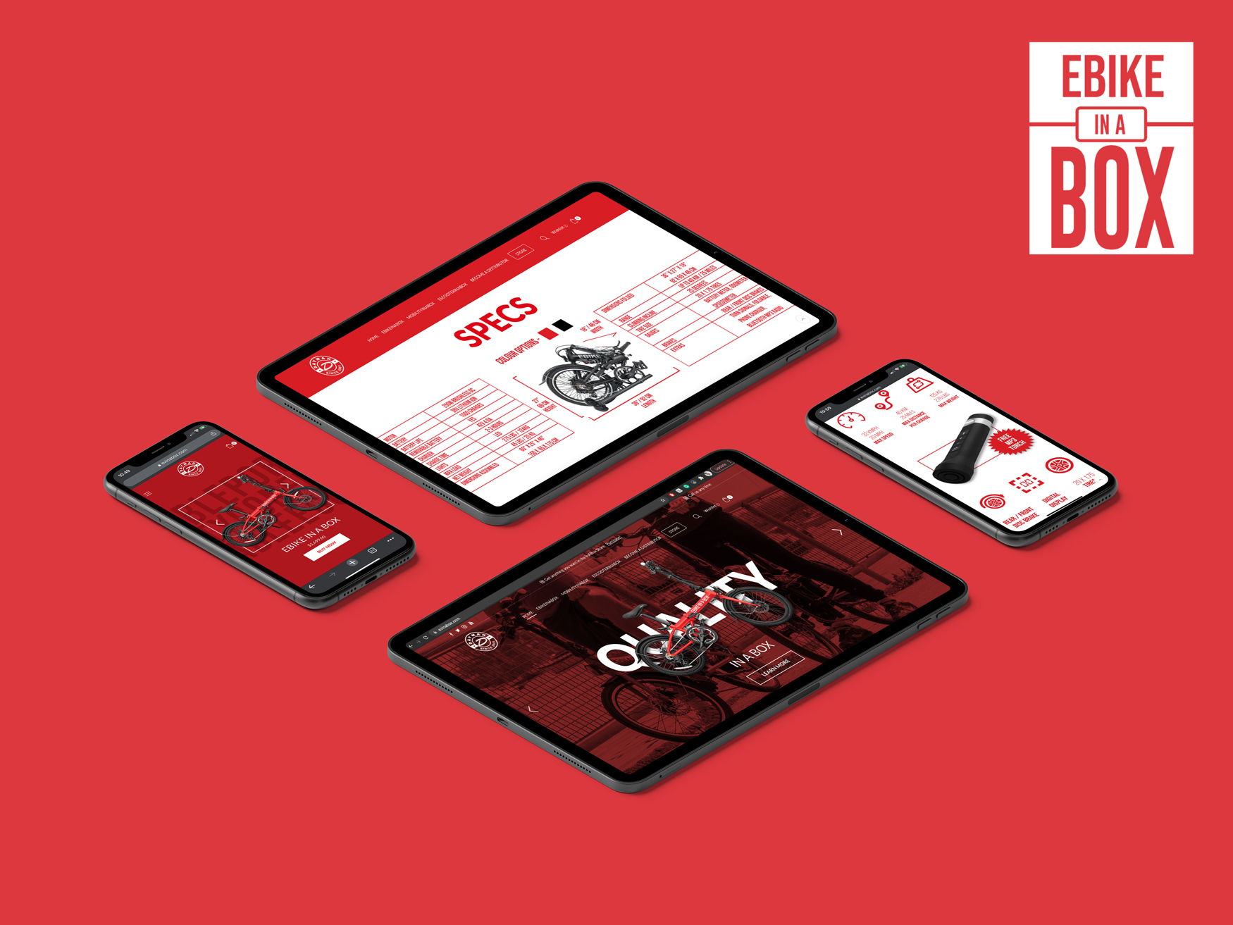
Ebike Page - UX/UI Proposal
The structure for the individual products pages follows the same arrangement of information, with the purpose of showing a correlation between the electric vehicles of the series.
For some of the sections of every page, some icons were crafted to highlight important information related to the specs and features of every product. Those pictograms were used on every page that showcase stats.Mobility Page - UX/UI Proposal
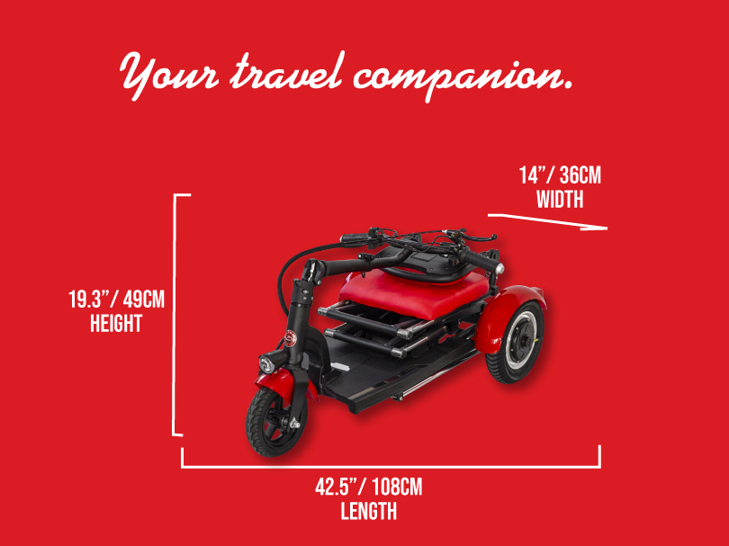
One of the sections on every product page displays a table with information regarding specific details of the electric vehicle, on that section is also displayed a graphic with the main product fold, as supposed to come inside the box when you purchase an evinabox vehicle. The intention of the graphic is, easily display the proper measures of each product.
The main structure of the product pages has a main banner, a section describing in more detail information about the product, a block with specs, features, and stats of the vehicle, a gallery, and button with the option to buy the product.
FINAL DESIGN
For the final design, most of my initial ideas stayed and evolved in a more dynamic and functional version of them selfs, some changes were made to do the user experience more appealing and easy to navigate, but most of the overall feeling and aesthetic of the website remaining the same. The home page starts with the main slider banner with images of the evinabox products, then some blocks of information with brief content of each vehicle, eventually a gallery of lifestyle pictures of people using the products is displayed, just before a carousel of images listing all the products with prices and the footer of the website, which contain the logo of the company and some legal information related to the type of products that the e-commerce page sells.
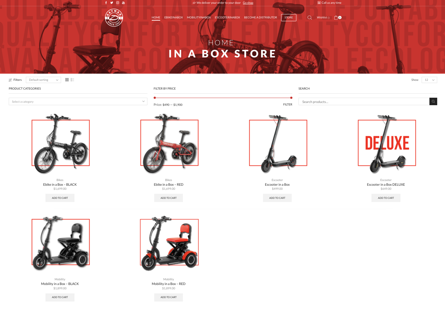
The store page is one of the most small pages of all, is literally the page one step before the user goes to check out, even though there is not a lot of information displayed on this page, a compeling main banner and the arrengment of elements trough the whole page, made this section of the site feel like an procedural extension of the website.
Distributor Page
UX/UI Design
The overall product pages have the same layout from top to bottom. The page starts with an parallax main banner displaying an image, name, and price of the product. Then highlights of the electric vehicle are placed, followed by paragraphs with more information related to it (legal and shipment information is also mentioned in this section). Eventually, some icons are shown beside the specs and features of the product. A video partition and a slide gallery are features all the way to the end of the page. And finally, there is an extra image of the product besides a button with the option of buying it. The footer closing the design has information related to legal and shipping information as well.
To see how the website works in real life, the following link redirects to the actual site, if you have the time to experience your self, please check it out.

